1 Goal: 1 Painting, 1 Week; Ichabod’s Ride Home
Summary: In a rush to submit work for an upcoming SCBWI conference, I share my process of painting Ichabod Crane, which was developed over the course of a week.
I’ve been developing my own adaptation for The Legend of Sleepy Hollow in preparation for the upcoming SCBWI LA conference in August. There will be an workshop for Illustrator/Writers called a “First Look.” This my fledgling foray out onto the winds of storytelling, although those who know me, will know that I do love telling some pretty windy tales!
Earlier in the process I started with a bunch of character sketches, then analyzed the original story so that I could put my own twist on it and still retain its original structure. One of the requirements for this First Look was to have the characters in a scene from the story. The moment that I have chosen is that fateful night that Ichabod meets the Steam-powered Automaton (or Headless Horseman in the original.)
Before we left for what would turn out to be an AMAZING vacation, I did this thumbnail and concept for the image.
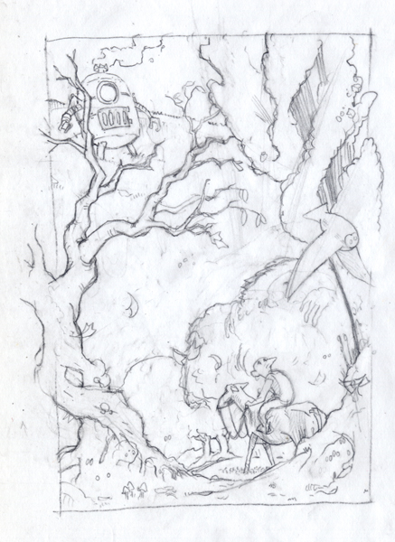
Some of the things that I really liked about this image are the circular flow around the piece and the owl. I like the sense of impending doom, and that Ichabod is distracted by the owl. This general idea remained through to the finish.
After we got home I realized that I had like a week to get my work in and freaked out. So what followed was me working my way to a finish as quickly as I could. One of the first major changes to happen was the move to a horizontal format. I changed my mind, and decided to move from a story book format to a 32 page picture book.
As a side note, if you’ve been following me on Instagram or Tumblr you may have already seen some of these images.
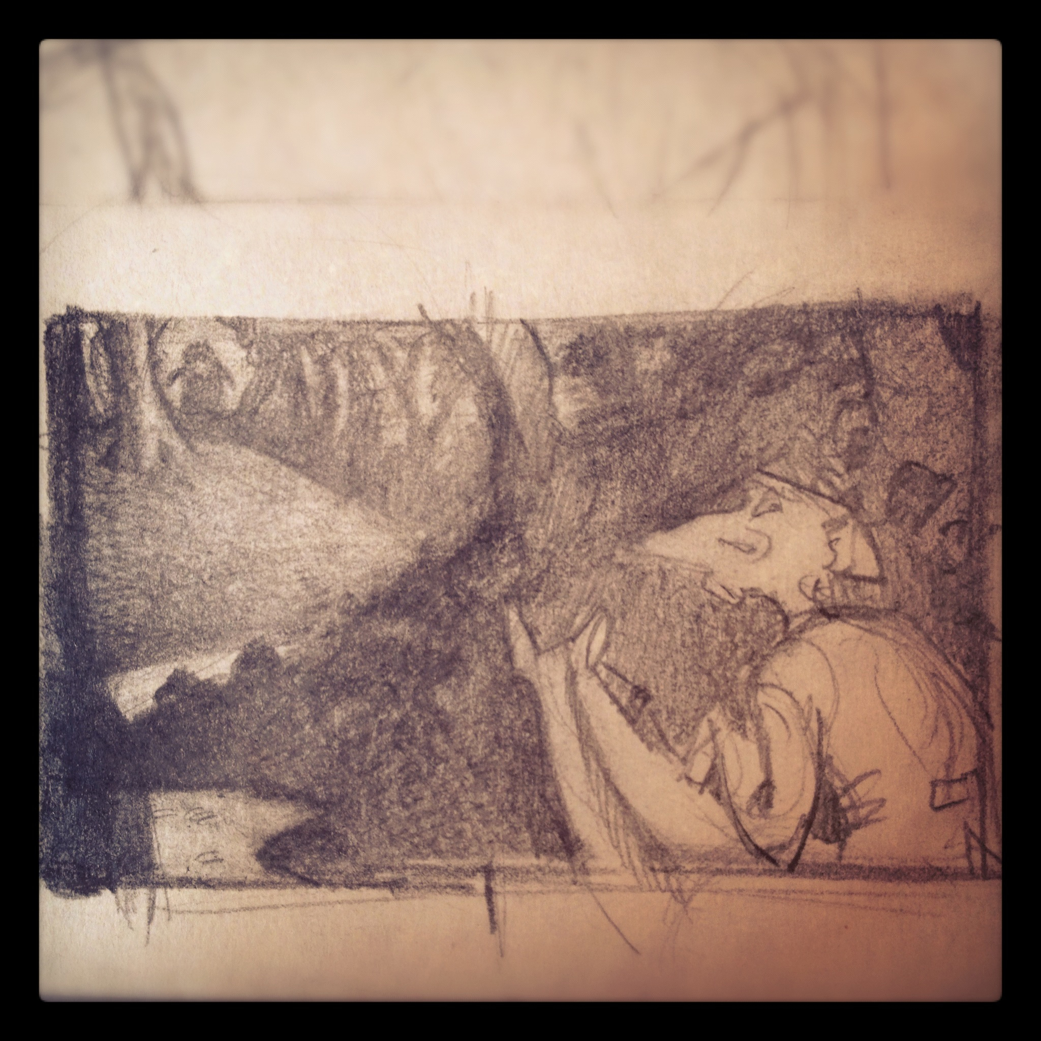
From this rough, I continued to develop the idea into a little more realized drawing.
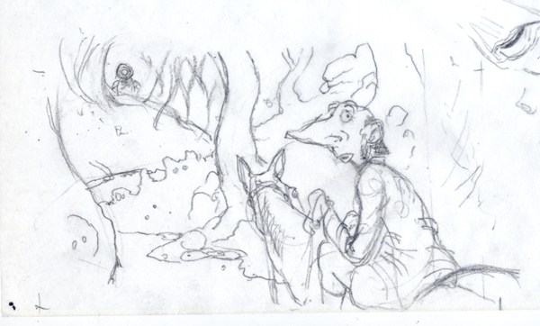
After this point, I started to do a little research into horses and following a tip that I got from Laura Innes, of the Paperwings Podcast, was to start using a mirror in front of me to work on the character’s expression… it definitely helped.

One interesting note is that our dog, Radar, was something of a model for the horse’s ears. Not bad for a little Chiweenie!
Here’s a snapshot of the final drawing, the dappled light is from outside.
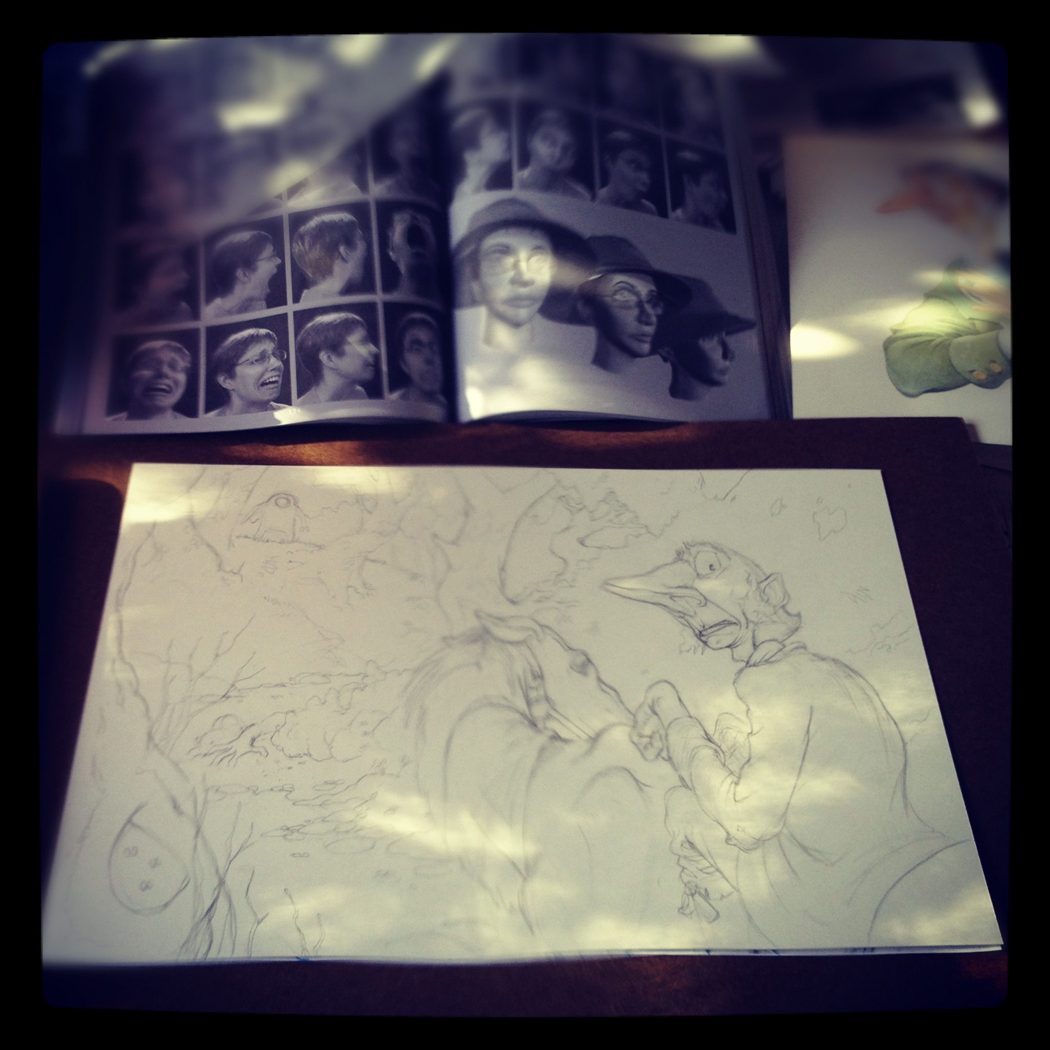
From here it was ON, I had about 4 days to get this painting done. I love a little challenge.
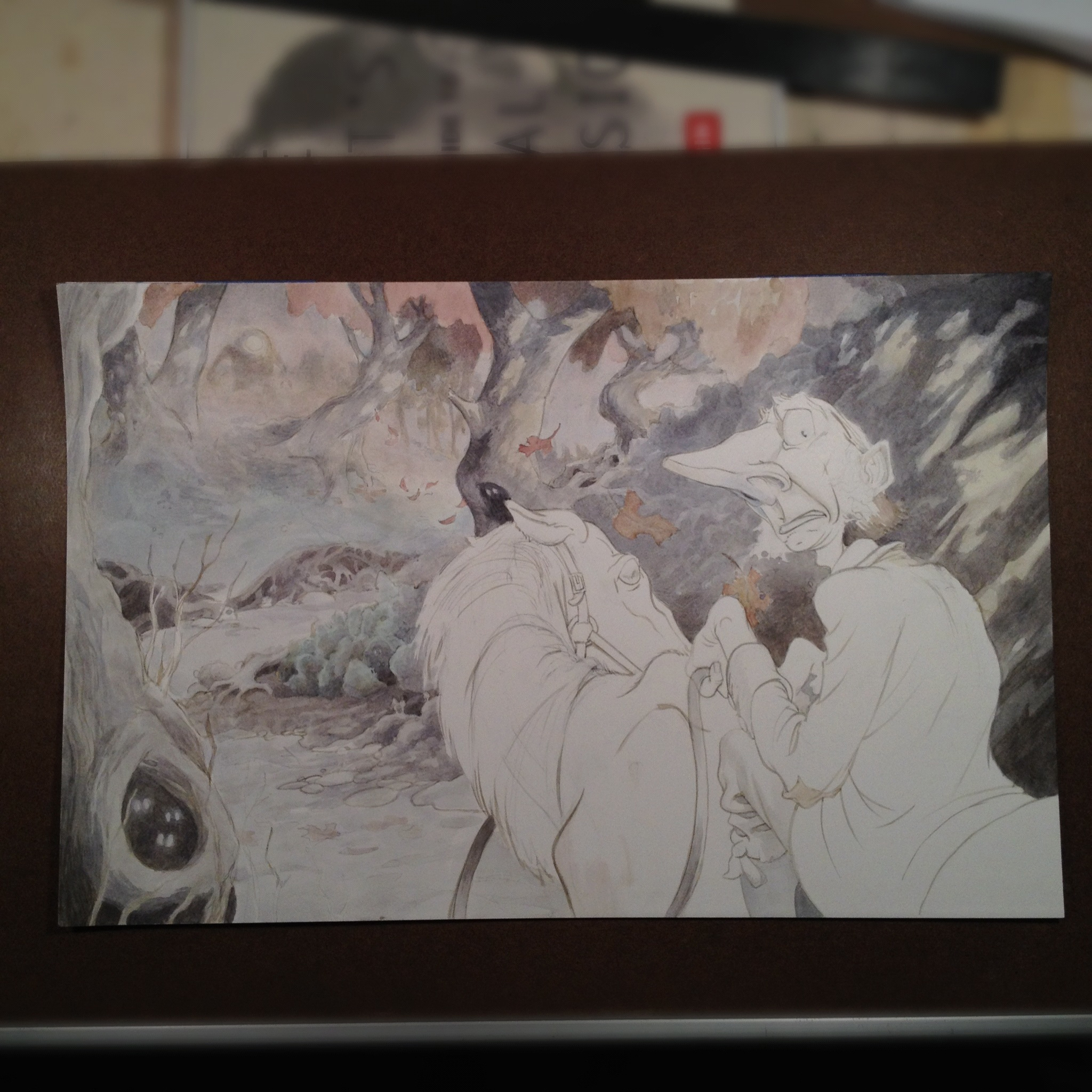
A Technical Note
I did use my recent discovery which is basically the watercolor version of a grisaille technique. I have to point out here, that paper plays a HUGE role in watercolor. In the past when I’ve used this technique I’ve used a hot pressed paper, and it worked exceptionally well, for this painting I opted for a Strathmore 500 Series Bristol Board with a Plate Finish. Painting on a plate finish is a little like painting on glass, the advantage to this paper is that the colors just bang off the page and you can get razor sharp edges, the downsides however are that it’s really hard to get a soft edge and because the pigments mostly sit up on top of the board it is really difficult to wash over something without lifting up the pigment below. As a result of my choice of paper, I really had to battle this painting. If I get to do this over again I will choose the hot press paper.
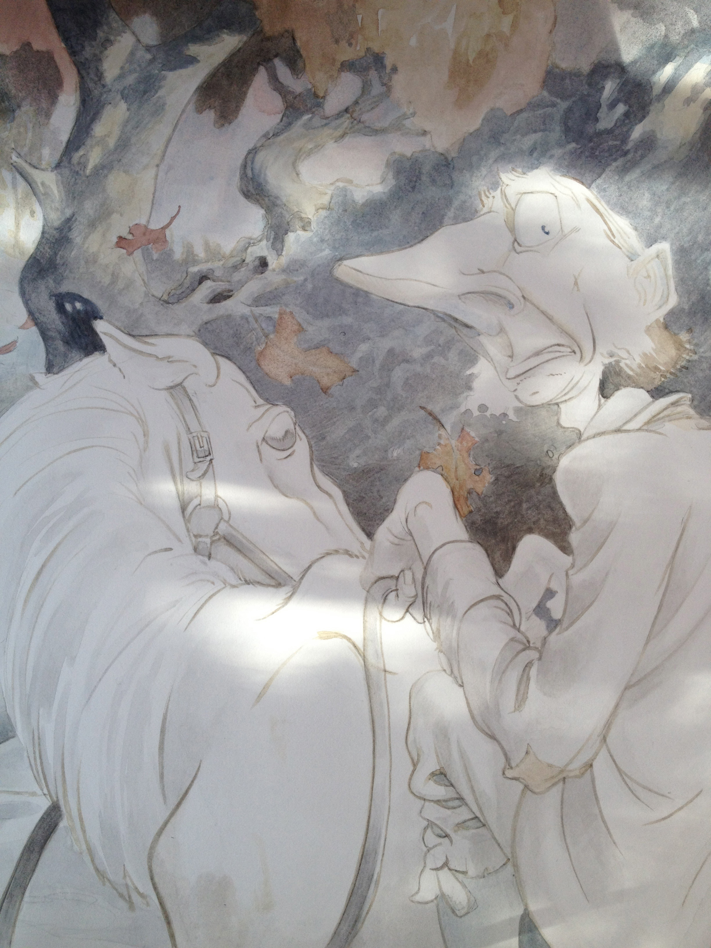
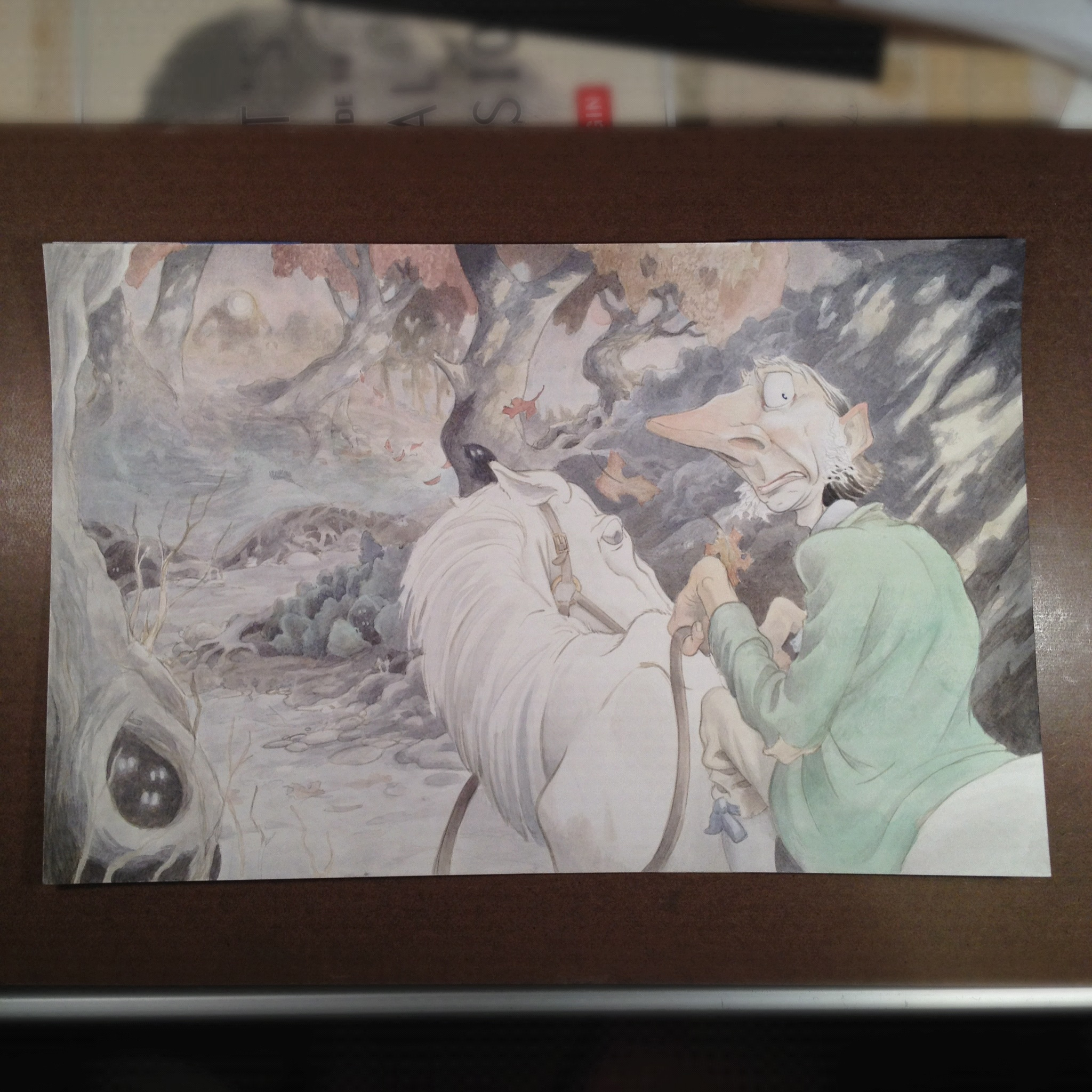
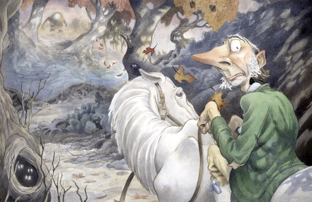
One fun thing that happened as I developed the painting is that little details started occurring naturally on the page. You can see on this image that there start to appear little nocturnal eyes here and there. Then as I was finishing it, I started to get the sense that I wanted some dappled shadows behind Ichabod. Now, it may have been that I’d been listening to HP Podcraft for nearly 8 hours straight, but the idea for a creepy shadow hand on his back kinda magically appeared. I have to admit I rather enjoy that little note.
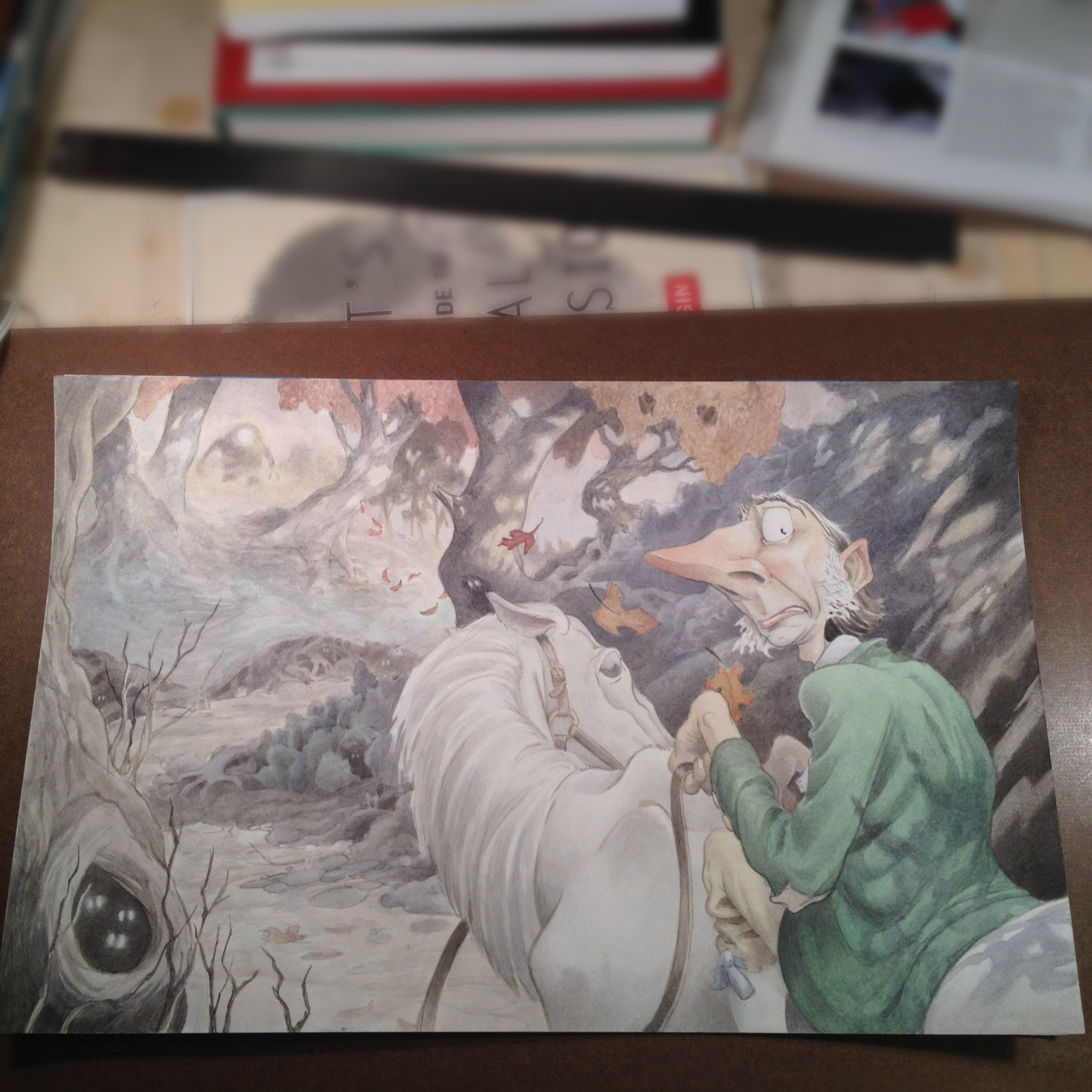
At this point, I knew it was done-ish but one thing that I’ve learned over the years, is to sleep on it. So, I have a small display easel at the end of my bed where I can set a picture. I stare at it until it stares back at me.
The next day I arrose, and spent another hour or two making final adjustments, then scanned it. I was pleasantly surprised at how little there was to adjust in photoshop.
As I rushed to meet the deadline for submission for the First Look, I jammed, put together some page layout thumbs for the whole book, rough synopsis, and the other character sketches into a PDF and sent it off. Technically the deadline was for 3pm, however the website just said on Friday, so there may be a little wiggle room. I got my work in by 4:50. Let’s just hope that it was close enough. Only time will tell, but I’ll update here if any news comes of it.
Post Script: As of Monday, July 8th, I did received notice that indeed my submission was received! What a great relief. I worked as hard as I could and now it’s out of my hand. Certainly there’s a benefit to having done the work in the first place, but I do hope that my work will be selected to be discussed at the Illustrator Intensive! Thank you all for your well wishes!
As ever I respond to enthusiasm, so please leave a comment, or ask a question. Thank you for following along on this wacky journey.



Brian,
Very intrigued with your process. Thanks for sharing all the steps. The expression is great and the perspecitve of the viewer behind the back is great. The camera here is your owl swooping in for a closer look. Good luck with First Look. I’ll look forward to the result and critique.
Thank you Donna. You know each piece I do is built on the last one, and I have to say that this image comes from taking the last month or so to focus on expressions and hands. Nice job on picking up on the Owl, it’s just flown out of the frame!
I was really interested to read about your experiences with watercolour paper… I’ve tried a lot of them too and you’re so right about all the different qualities they have. I almost always use Hot Pressed myself, and my absolute favourite is Fabriano. Arches is supposed to be one of the best, but it’s no good for the kind of detailed coloured pencil work I often do on top of the watercolour. I’ve battled Arches paper a few times! And with watercolour it’s also funny how different all the different pigments can behave too. Which watercolours do you use?
Thanks Katriona, wow I’ve not used Fabriano before. It’s interesting to hear about your experience with it; that makes me want to give it a try. Do you find that the Fabriano has more tooth to the Hot Press than Arches, and is that why it’s more appropriate for the pencil work? or is it just a hardier paper? Because, one of the really great things about the Strathmore board that I used is that it can take any abuse that you can dish out and retain most of its surface; I mean to the point of washing down the board to start over again (which I’ve had to do!) The Arches is definitely a lot softer and doesn’t tolerate as much lifting and scrubbing before the top layer of paper starts to come off (which is freaking hard to recover from, I can tell you!) So, I think to work on the Arches paper one needs a clear sense of direction for the piece, as the painting surface on it is less malleable than the board. But it’s all give and take, and the give of the Arches paper is that blotting and atmospheric effects are quite wonderful. I’d be interested to hear about the Fabriano paper, perhaps you’ll do a quick blog post about it?! (hint.. hint… hint)
To answer your question, mostly Windsor Newton colors, but I’ve also gotten a few tubes of Daniel Smith colors which I’ve been happy with. I have to admit that I’ve not done too much exploration of colors yet. I’ve had friends who’ve really love the Holwein colors, as they seem to work almost like gouache. As for how the pigments work, I’ve actually got a chart from Windsor Newton of hand painted paint chips which lists each paint’s qualities. I’m just starting to get into understanding all that.
Thanks for the comment!
Fabriano is quite tough, and does stand up to a lot of punishment. I found with Arches that it was quite abrasive on the the pencils… almost like drawing on sandpaper! Which is weird because like you say it’s quite a soft paper when it comes to paint. It wore down my pencils really fast and it found it hard to achieve fine detail… even with a very sharp point my pencil work was coming out a bit fuzzy. For watercolour mixed with coloured pencil work Fabriano is my favourite, but I also like Saunders Waterford paper. It has a lovely warm tone, but even the hot-pressed has quite a pronounced texture which can be a problem when scanning. I tried painting on illustration board once, but had a lot of trouble getting smooth washes so I never tried it again! This is a great site for detailed comparisons of paper: http://www.handprint.com/HP/WCL/paper2.html
Windsor & Newton paints are the ones I use too – they’re wonderful but I haven’t really tried any others.
I’d love to do a ‘materials’ blog post if I get a free moment, but you know how it is! I’ll let you know if & when I get round to it though 🙂
Hi Brian,
Thanks for sharing your artist process. Your work is fabulous! I have my fingers crossed that you make the deadline.
Cheers,
Sue
Howdy Sue,
Thanks for checking this out, and I appreciate your kind words. I also checked out your website and like that combination of realism and fantasy that you’re playing with; really nice!
I’ll put a note at the end of the post, but thankfully, my submission was received! So, I’ve done what I can, now it’s lots of finger crossing.
Nice piece Brian; good luck with the event.
A good friend of mine uses and teaches the advantages of underpainting in watercolour –
http://barrycoombs.wordpress.com/ if you’re interested.
Have you considered liquid acrylic on plate board? Your grisaille certainly wouldn’t lift. I’ve used watered down acrylics as a watercolour substitute in the past, with very good results.
Howdy Scott,
Thanks, for checking this out. Yes, now the preparations are started in earnest for the conference. For the first time in a while, I am focusing on creating a really good actual physical portfolio.
I will check out that link, I’m definitely interested in using something the FW acrylic inks, a number of other illustrators are using them and getting some nice results; in particular I am thinking of Charles Vess and LeUyen Pham. Thanks for the referral!
Cheers
I really appreciate your sharing this process with us!
Thank you so much for creating a step-by-step of your process! It’s really cool to be allowed insight into another artist’s steps and strategies. Thank you for taking the time to do this!
Quick question – in one of your photos (“Snapshot of the final drawing”), I noticed you have a neat book with expressions. What is that? Is that something I can purchase?
Thanks again!
Meg
Howdy Meg,
I’m glad that you enjoyed the process. As for the book, I’ve been studying expressions and characters for a month or so, and one of the steps that I took was to order a few books off Amazon (after checking my local library and bookstores first of course!) I order three books together in one of those Amazon bundles: Facial Expressions: Babies to Teens, Facial Expressions: A Visual Reference for Artists, and The Artist’s Complete Guide to Facial Expressions. You should be able to see them all from this link.
Perhaps I’ll do a book review post someday, but for now, those books along with the notes from the Paperwings Podcast I mentioned above, I’ve been working on creating characters that better emote.
I hope this helps
Fascinating post! I think the final picture is wonderful, the spooky eyes are a great addition and the aspect of the character and horse are so engaging. Working in this way must require a lot of patience but it looks like it’s so worth it.
Can I chime in on this watercolour paper debate for a second? I’ve tried both Arches and Fabriano Extra White, both hot-pressed (always hot-pressed as I find that the fluidity of my fineliner pen gets “interrupted” by the bumps on cold-pressed paper and I don’t like the way the wash spreads out uncontrollably on CP either)
I like both Fabriano and Arches but sometimes I find that the Arches is too creamy in colour. I wish they did an extra white version. I find that the pen doesn’t flow as easily on the Arches either, the paper is not absorbent enough of the ink and I have to use a a thicker-nibbed pen. The Fabriano Extra White is good but sometimes I find that it can’t withstand too many fine layers before everything looks a bit mucky.
For paints I find that Schmincke are so amazing. Their pigments are so rich and satisfying, I’ve tried Lukas and W and N but Schmincke are by far the best for me. I’d really recommend them to anyone, they’re a little pricey but are my most prized possession.
p.s. I wrote a wee blog post on the trials of finding the right paper a while ago. It seems that I still can’t haven’t found the perfect one since: http://www.sheena-dempsey.blogspot.co.uk/2011/01/paper-paper-everywhere.html
Howdy Sheena,
Fascinating stuff, I checked out your blog and it’s pretty wonderful. I look forward to delving a little deeper into it.
Yes, the Arches tends to be a little yellow-ish. I’ve found that one can adjust for that in Photoshop by setting a new white point in the Layers panel, but often times I leave it as is. The Strathmore board however is much brighter, and has that blue-ish white that’s so bright. After some of the earlier comments, I called over to Daniel Smith and talked with a fella there about papers. He loved the Stephen Quiller paper (which is new to me) and when I talked about my connundrum about the board vs. the Arches paper, he pointed me to a new Arches product called Arches Art Boards which I may try out sometime.
Considering that both you and Katriona have had positive experiences with the Fabriano paper, I am going to get some from my local store and give it a try.
Thanks for checking out my blog, and I look forward to reading your blog post too!
Cheers,
It was really impressive to see all the paintings and read about them …..
Thanks
Rakhshan
Fabulous!! Thanks for the book titles and the link!
Thanks Brian, good luck with the Fabriano! 🙂
Thank you for checking put this post Sheena. It’d be fun to set up some kind of “paper challenge” with all these options…. hmmmm
Thank you Meg, I hope that you get a lot out of them.
Cheers,
Really great work so much energy in the Icabod painting !! I always enjoy reading about another artist’s process too- so thank you for sharing !! Bonne Chance !!!
Hi Brian,
Enjoyed the watercolor piece you blogged about especially explaining
about the grisaille technique. When I did actual acrylic paintings
the type of paper I used was so important. I always preferred Strathmore
D’arches. What was the final size for the watercolor? What are your
favorite watercolors?
regards,
Paul
Hi Paul,
Thanks for your comments! This particular piece is about 12 X 15″ and I use mostly Winsor Newton colors, although I have a growing collection of Daniel Smith paints as well.
I can’t say enough about the paper. I really like the way that Arches Hot Press blends, and I’ve been working on getting sharper lines out of it too. The Strathmore board that I used for this picture is a lot different to paint on. I do like the saturation and the razor edges, but I’m not sure it’s worth the trade off of difficult blends and difficulty painting over layers of paint. Perhaps if I was working with Acrylic Inks or something it would be easier.
Thanks!