
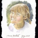

This most recent piece was actually set in motion about 6 months ago, in an auction to raise money for a local school, I donated a portraiture drawing session. What originally started off being a 1 hour drawing session has morphed into this watercolor painting.
The girl is about 5 years old and her parents were the top bidders who won the portrait. The way that the painting came about is that we arranged for me to come to the school and to do some life drawing on the spot. But little children often suffer from Antsy-pants, soooo, I brought my camera with me. What I ended up with was two nice drawings that gave good gesture and sense of her proportions, and 2 or 3 pictures that were worth anything. Feeling good about that, I came home to the studio and set to work. Obviously photo’s give one the ability to really get the details of the face. I really tried hard to leave things as fresh as possible, but my early inclination was to turn her into an 80 year old woman by painting into every nook and cranny of her face! Of course children’s faces are soft and round, corners and lines have yet to happen, and so my intention was to create a sense that the colors and values were just ever so lightly floated there.
Technically, I felt that I found a good stride with this painting. I enjoy small crosshatching marks, and with watercolor one is able to build a rich color and texture due to the transparent quality of the paints. My heros for this kind of mark making would have to be George Seurat, his drawings are positively sculptural, and Andrew Wyeth (who could not just LOVE the way that he created his final paintings.) This kind of mark making shows up in some of my pen and ink work as well. For me it’s a great way to develop tone. This was really the first time that I employed this method in terms of creating a whole painting with it.
Another note that I was conscious of during the creation of this piece was edges. There is a big effort to display hard edges, and to balance that with soft edges. The soft blending along the cheek and nose area are of particular joy for me. The outer edge is another place where I wanted to show some softness, as well as the rough brush strokes on the paper. For this I looked to John J. Muth for inspiration, I find that his blends and backgrounds are rich with wet into wet blends, and sensitivity to color and edges. I have to admit it was a brave moment putting those moves on there. At that moment, I had the head and shirt done, and most of the hair. So, I had to take a deep breath and launch into that, and well, the results are there on the page.
Finally, speaking of the page, the paper itself is a handmade piece of watercolor paper from Twin Rocker in Illinois. I was gifted a sample pack of papers from them, which I adore. One thing that I didn’t account for was their sizing (the glue in the paper), and the way that it accepted water. In other pieces I’ve painted on Strathmore board, and Arches Hot Press. This Twin Rocker paper really should have been soaked then stretched rather than painted directly onto, consequently the watercolor didn’t soak into the paper very quickly. However the back side to that is that the color also lifts very easily; making corrections was a breeze. The rough nature of the paper and the natural surface were positively a joy to work on.
I hope I have more opportunities to do portraiture, it was really fun. If I am being really honest, I admire this piece for the things that it is to me. So many times, I can create something and find that in the end, I am still not quite satisfied with the results. Here, I am.


Sorry, comments are closed for this post.