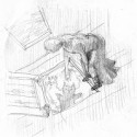
One of the projects for the Illustration Master Class in Amherst MA was to create a cover image for a steam-punk retelling of the classic “The Wonderful Wizard of Oz.”
Conceptually this combination of two worlds is ripe with possibilities. It is an area that I hope to mine for a few more pieces. The first piece is the cover image, and these are my preliminary works for that.
The scene I’ve chosen for the cover is from the beginning of the book, when Dorothy and Toto are in the cyclone over Oz. In the book, there’s a moment when Toto falls into the hole where the cyclone cellar was, Dorothy rushes over to save him. Only to find that he’s buoyed by the air pressure of the cyclone. I chose this scene because it allowed me to show that she was falling into another reality. Around her will be the gray and drab world of home and below will be the radiant colorful land of Oz. I hope to heighten the effect with color as well, choosing desaturated grays and muted tones for the house, and vibrant golden greens for Oz.

Here is the compositional drawing. I am working on developing angles, trying to set the stage so that there is the possibility that Dorothy might fall into the hole. She should be right on the edge. There may be further refinements in this drawing later, simple things like lifting her heel up on her left foot, maybe pointing that right foot. Or, maybe I’ll try switching the feet around so that the right foot is forward and the left is back. Clearly she’ll need a top too. Those changes will be made after getting a model to pose for me and taking some photo reference. This will also help to add to the overall steam-punk style too.
 Here we have the initial value pattern. Again, to heighten that contrast between the drab world that she’s leaving and the luminous world of Oz, I’ve tried to keep the house in 50% gray, and kept Oz and Dorothy in 20% gray. A simple triangle or zig-zag pattern really. (I guess staring at those Hokusai prints flows out here and there.)

Now, we come around to the more finished value study. While I will make adjustments to bits and pieces of the drawing, this will be the template for the final piece. The area’s that will receive some immediate attention will be Dorothy’s pose, the whirling cyclone clouds (they just aren’t whipping around enough for me yet,) and defining the Emerald city down there on the ground (right now it’s some geometric shapes.) The Yellow Brick Road should also be a bit more clear after the color, right now it’s the white line that leads to the Emerald City.
Stay tuned for more developments. I may be releasing some of my sketchbook sketches going forward too, just for fun. Please feel free to leave comments, I like to hear what other’s think!
PS: to see the next post about this image go to Post #2: Dusting off Dorothy


I'm sure you've taken all of this into account, but what's your plan for type placement? It looks like there's room at the top for title and author, but I'd be concerned that it would feel too much like it's pressing the rest of your image down. (Remind me later and I'll tell you all about the joys of weighted-bottom mats.) Maybe extending the floor boards down a smidge would allow some more calm acreage for author name without distressing your composition too much? Toto also looks like he's getting his brain flossed by the yellow brick road. And it feels to me like Dorothy would take a header through the door if all of the weight were on her left leg with the ball of her foot over the threshold. Scootching her back a wee bit could help. Hope any of that helps.
This is looking really nice Brian- as per our discussion- I'm looking forward to working on this with you.
I hesitate to post full critique so publicly- so I'll e-mail it to you with my draw over notes.
BTW- at the IMC we told everyone NOT to worry about leaving room for the title-it makes a better portfolio image- and you can always stretch and change something photoshop if you want to do a version that gives more title space.
Have you looked at Jon Foster lately- if not I check out some of the ways her play with perspective in his newer pieces.
talk again soon
Rebecca
[…] been some great learning experiences so far. You can visit where last we left Ms. Dorothy here, and after viewing that should handily be able to distinguish the two images. “Why, […]
[…] image go to Post #2: Dusting off Dorothy to see the original post about this image go to Post #1: Steampunk Wizard of Oz Filed Under: Children's Books, Fantasy, Painting, Process, Watercolor, Wizard of Oz← Orbital […]