
Summary: This is a blog post about some experiments that you can use to gain a deeper understanding of color as a narrative tool, and for creating a more harmonious color pallet.
Recently at the SCBWI San Francisco Illustrator’s Day, the wonderful Antoinette Portis sat down with me and we had a pretty great talk about my portfolio. One of the major notes that I took away from that meeting was her keen observation that a key element that might help to take my work a little further, was to focus on using color as a tool to help strengthen the storytelling in my illustrations.
This blog post is a record of some my current experimentations as I find my way towards a better understanding of color as a narrative tool. At this point I’m going to pass over all the hoopty-baloo about what color can do, what it can mean, how it can affect the viewers, etc. etc., there are plenty of books out there on that, and focus on some ways of creating a more harmonious color pallet for an illustration.
Step One: Groping for Answers
My first random move forward was crowd sourcing (of course!) I put out a call for “any good color resources” onto Twitter, Facebook, and LinkedIn. Thankfully, some folks gave out some good options.
One of those good ideas was for me to make the very long trek, off of my butt, across the room, and all the way over to my book shelves where I had to grab, with my bare hands I might add, my copy of James Gurney’s “Color and Light” (if you don’t already have this book… why not? It’s amazing.) I picked up his book and began by rereading about his ideas on “Color Gamuts.” Basically, as I understand it, a color gamut is the range of color which is found in an image.
Part of what I believe to be the the value of James’ idea is that we as artists, by considering and using color gamuts, are developing a tool that helps us to communicate more clearly and that will help to create works that are overall stronger pieces. As a friend of mine once said, 90% of painting happens on the pallet.
I first read about this idea many moons ago on James Gurney’s blog the Gurney Journey (again, if you don’t have his blog on your radar.. why not? It’s brilliant.) He has a whole wonderful collection of blog posts wherein he talks about Color Gamuts in delightful detail: here’s the original post, and a follow up series: Part 1, Part 2, and Part 3. For me, this is pretty interesting and heady stuff, so after reading the section in his book, and all the blog posts, I was super happy to find that he’s also done a video! Gamut Masking by James Gurney.
I’d recommend checking out James’ posts about this now, as I’m not going to recap it here, he just does too good job explaining it! I’ll wait here.
Analogous colors are next to each other on the color wheel.
Step Two: Turning Ideas Into Actions
All this experimentation and research wasn’t without a goal. At this time, I was also developing an illustration for a client, and I really wanted to make it sing. I had already done the sketches and had a clear direction, the next step was to pick a pallet that would help to tell the story.
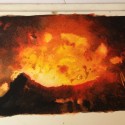
The first thing I did was this exploratory piece as reference (shown here on on my desk).

As I was painting this from the reference photo (pictured at the left) I was making intuitive choices about which paints to use to achieve the hot atmosphere that I was aiming for. This study was done for two reasons: one, how the heck do you paint lava? and two, what colors should I use to create the atmosphere that I was dreaming for the final. Here is a close up of the study.

The colors that I ended up choosing were Van Dyke Brown, Paynes Gray, Windsor Newton Blue (Green Shade), Vermillion Extra, and Cadmium Yellow Light. Basically 3 primaries, and two neutrals.
On my desk I had one of my favorite reference books (which I’ve mentioned before); Everything You Ever Wanted To Know About Watercolor. I was specifically reading the section about different color harmonies (you remember these from art class, right? Monochromatic, Complimentary, Analogous, Split-Complimentary, etc.) After finishing the reference piece, I saw that what was naturally occurring was an Analogous Color Scheme.
This decision about the color harmony defined the shape of the color gamut that I would be using on the final, and a color pallet began to develop. Bingo.
As ever, thank you for reading. I respond well to enthusiasm, so feel free to leave a comment here, drop me a line, or follow me on the Insta-tweet-a-books.
Instagram • Facebook • Twitter
If you enjoyed this post, please consider supporting my work by making a small monthly donation to my Patreon Page.


Sorry, comments are closed for this post.