Summary: This in depth blog post is about the connection and implications of using values to affect the mood of an illustration. The images created by Jon Jude Palencar are used here with permission from the artist.
This post is the result of two different conversations with two different friends that I’ve had in the past few months. In conversation one; my friend said to me that one of the best ways to solve your own problems in life is to find somebody else, give them advice, and then follow it yourself. I don’t doubt that he was talking about me to me.
In conversation two my friend and I were talking about our personal voice in illustration, I recommended to her that she take a closer look at the work that inspires and influences her, and examine them for all the qualities that she liked. In other words, the “why,” as in “Why do you like that piece of art?” In doing this that she would be able to see the continuous thread that ran through all these disparate images, and that thread would be her personal preferences, her aspirations. Expanding out from there, she would be able to strengthen her own works by explicitly understanding her influences. Simple, right?
So, you see, this post is me, taking my own advice, and hauling some art into the light, expressing my perceptions of them in an effort to reveal qualities which I endeavor to imbue in future illustrations.
Mood and Tone; The concept
Two artists who are wonderful in the conveyance of Mood and Tone are John Jude Palencar and Alfred Hitchcock. Both of whom are able to create intense, and sometimes somber, moods in their works. I’ve been a fan of John Jude Palencar’s work for quite some time, however it is rarely the subject matter he chooses which captivates me, but it is the way he portrays things, his technique, pallet, and composition. Which add up to the creation of specific moods through out his work. So, it is his use of the tools at hand which he chooses to express himself that I admire.
Because John Jude Palencar’s expressions are often psychologically charged, that, I thought a nice companion artist would be Alfred Hitchcock. True, Alfred Hitchcock works in a different medium, but he incorporates many of the same tools to create the myriad of moods and tones in his work. He is a Master of composition, in the use of lights and darks, and also in his ability to imbue a psychological tension into his pieces. For this side by side comparison we’ll be looking at a still image from Psycho that I pulled off the web, along with an image from John Jude Palencar’s website. I should pause here to thank Mr. Palencar for his express permission to use his work here, as well as to credit the Opera Company of Philadelphia who originally commissioned the Madame Butterfly piece that we’ll be looking at. Links to these sites can be found at the bottom of this post, please check them out after your done reading.**
“Put light colors next to light colors and dark colors next to darks, then where you want the viewer to descend, put dark next to light.” ~ Harvey Dunn.
This succinct sentence holds the cornerstone to quality illustrations, and the nature of communicating with images. Part of what Harvey Dunn is talking about here is a strong value structure. A strong value structure is absolutely essential towards crafting and communicating with an image. If that structure isn’t there, the picture will be confusing and ineffective. As artists we are communicators, and through the conscious use of the tools at hand it becomes possible to communicate those ineffable qualities of life, rendering visible the invisible.
Pretty heady stuff, but there is a simple way to view this as well:
Mood=Tone=Value
To start with let’s open ourselves to the wholeness of these terms, as they encapsulate multifaceted concepts.
Mood can be a slippery idea to get our hands on. People talk about mood all the time, but what are they really saying, what is a mood? As a working definition let’s agree that mood refers to an emotional state of mind. We can talk about moods like, Joy, Elation, or their counterparts, Sadness, or Melancholy. One might go so far as to say that Joy and Elation could be described as being “light” moods, where as Melancholy and Sadness might be “darker” moods. It is this critical connection which follows through to Tone and Value.
Tone can be defined in lyrical terms. We can talk about Tone in musical terms; low and high, soft and hard, or quiet and loud. Consider the “tone” of songs by The Talking Heads, the Grateful Dead, Tool, Sonic Youth, or Alison Krauss. In most cases each song tells a story of sorts, and the tone of the song can put you in the mood of the song. Just for example take the simple story; boy meets girl. How many times have you heard that one! But, depending upon the tone of the song, it could be the blues, or a cosmic metaphor. The tones clue us into the mood. Perhaps not coincidentally, in the visual arts Tone also refers to the general effect of light and shade in a piece. Another way to say the same thing is that Tone refers to the general effect of the value structure in a piece.
Value, can be defined not only in terms of a relationship of dark to light, but also in our relationship to ideas. Ideas that we either judge to be, in it’s simplest terms, good and bad, right and wrong, etc. Now, as you will have well learned by the time you are able to read this, there is a lot of gray area between these two extremes! That metaphor, the transition from dark to light, is best shown visually as a value scale.
So, I hope that you are now able to begin to see the line of connection that exists between Mood, Tone, and Value. They can all be descriptors for a piece of work, and as creators these become our tools with which we are able to draw out emotional cues in our work. After all, the very essence of life is a constant flux between extremes, it is not by any means monotonous, or of one tone.
The Images
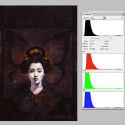
There are many ways that an artist can communicate visually. For the sake of this post, we are going to focus on the value structures of each piece, and leave hue, saturation, and texture for another time. Therefore, I’ve shown the images with histograms next to them to give us a linear way to think about the value structures of the pieces. A histogram is basically a graph that describes black to white on the X axis, and intensity on the Y axis. This is a good tool to examine not only other’s work, but your own as well.
This is John Jude Palencar’s “Madame Butterfly” which was originally commissioned by the Opera Company of Philadelphia. Please take note of the histograms to the right of the image which show a heavy dose of darks. {you can click on any of the images to see them larger in a new window.}

To adjust our vision towards dealing with value, and for the moment forsaking his beautiful pallet, a gray scale version of the same image. Notice that the image still communicates very clearly. Try to become aware of the sense you get about the painting.

The thing that is most notable to me in this image is the sense of isolation. Her face is literally highlighted, which not only emphasizes her expression, but graphically sets her apart from the muddled and dark space in which she exists. Here, Palencar has adhered to the same strategy as was mentioned in the earlier quote by Harvey Dunn. If we take a moment to pause, and consider the value structure we can recognize that the majority of the image is dark, that is to say more than 50% gray. Even the highlights on the hair is around 50% gray! While most of the edges in the pieces are delineated by a shift in value, there’s a lot of detail that is left to sink into the darkness. This is a very effective method for highlighting details and areas of focus, and allowing other areas that are not of as much importance to simply be implied. It is also an effective way to set the tone of the piece.
Can we expand the concept here and make the leap to viewing the value structure as a narrative element? Would it be correct to assume that Madame Butterfly has a lighter, or higher value ( value in the sense here of moral value ) than her surroundings? Is she a beacon of light in an otherwise dark place? I can only assume so, since I have yet to see the play. These kinds of unfolding meanings are through the linkage of Value, Tone, and Mood. When we take a moment to analyze good work, we can begin to play with these concepts of, in this case, isolation, moral standing, and an overall tone for the play.
Next, I’ve chosen to take a look at this still from Hitchcock’s Psycho for it’s similarity on the whole, of emotional and psychological tension. While the media is different I find that there are some good connections between the two images.
Here’s Marion Crane. In this still she’s been driving all day, tailed by a cop, and finally into the night. The whole scene is quite nice as it comes to this point, and slowly all light around her starts to vanish, save the dashboard light, which highlights her face. Also, notice the histogram at the right side of the image.
 In both of these images we have an illuminated face set in a dark space. Setting aside for a moment the huge amount of emotional information transmitted by their expressions, we still can understand the mindscape, the tone of these two images, which is remarkably similar.
The space and light become descriptors, not just of the forms as they are but also of the overall mood. As the histograms show us, there’s a heavy dose of darks in each of these pictures. In fact I don’t actually think that there is any pure white at all in the image of Marion Crane. {poor Marion, we all know how this ends.} We can begin to generate our own associations with what the dark represents as a metaphor. Who wasn’t afraid of the dark when they were a child? It’s the unknown and we tend to fear.
Also, the darks can be a visual cue towards an inner space, towards introspection as a result of the isolation. This is accented by the image of the seemingly detached floating heads. The heads become symbols. It seems to me that both the images are pointing at an emotional state of mind, or mood, of isolation, of surrounding darkness, and a moral position. I wouldn’t go so far as to say that these two pictures are implying the same state of mind here. The faces communicate quite the contrary. However, in working within the line of thinking about the Mood, Tone, and Value of the images, they are very similar, which is to say that both of the artists have utilized their tools in a similar way to help lead the viewer towards what it is that is being communicated.
We can get a sense from both of these images about the ideas that the artists are communicating with us; the sense of isolation and drama, of introspection, the moral and mental state of the characters. The foundations for these moods are rooted in a strong value structure, and build upon this foundation are more nuanced emotional details, transmitted through the faces of the characters. While there are a great many more details and decisions that have going into these two images, their foundations are very similar, and as with many illustrations which strive to communicate beyond the obvious and into the deeper realms of meaning, one must work with value to establish a concordance of tone and mood.
I hope that this journey has been of some benefit to you, and that you may take a second, third or more looks at you favorite artist, regardless of their medium. The pictures are talking, we only need to listen.
** Again I want to thank John Jude Palencar for his kindness in allowing me to use his work here, please find out more about him and visit his site { weblink here }
If you are interested in stills of Alfred Hitchcock check it out { weblink here }
If you’d like to see where I’ve started to utilize these concepts in my own work, look here and here.


Sorry, comments are closed for this post.