
I have a confession to make, in my spare time I like to study drawing and painting. Please don’t tell my high school teachers this as I’m sure that hearing that would give them a heart attack.
My intention with this post is to share my study habits so that you might see something new or have a fresh idea, and thus become inspired to to find a new ways to fine tune your own craft. I think that it is super important to continually grow and stretch our boundaries, especially for illustrators.
Summary: Mixing colors, and figuring out how to utilize those mixes in a painting can be a daunting task to start with. I for one, have ruined more than one good drawing with the hap-hazard application of paint. Achieving a fuller understanding of how the colors work together on the is a nice place to start.
Source Material
One of the things that I’ve accumulated over the years are a bunch of instructional “how to” books. As with all things, some of these have been immensely useful,while others… not so much. One of the books that I’ve found a lot of value in has been the “Everything You Ever Wanted To Know About Watercolor” edited by Marian Appellof, which is where I am drawing this exercise from. The original source for this exercise is David Millard’s chapter “Getting to Know Your Colors: Mixing “Chickens.”
Getting To Know Your Friends
In watercolor learning the qualities of each of the colors can eventually become like second nature to you. With the application of some conscientious practice, you will begin to ‘instinctively’ know which paint to go for, and why. You’ll learn whether it’s a granular color, if it stains or not, and when you’re mixing colors on the fly, you’ll want to know how aggressive the color is when mixing with other colors. As you become more familiar with each color, your choices become more natural and deliberate.
Essentially this exercise is about systematically mixing a series of colors in pairs so that you will experience each paint and the qualities thereof.
Choose a Pallet
The first thing we’ll need are some colors to mix with. For my example, I intentionally used this small and simple pallet of colors:

- Cadmium Red
- Permanent Rose
- Cadmium Yellow
- Turner Yellow
- French Ultramarine Blue
- Cerulean Blue
- Cobalt Blue
- Yellow Ochre
- Raw Sienna
- Burnt Sienna
- Burnt Umber
You can see right away that these are mostly pairs of cools and warms of the primary colors, with some earth tones thrown in the mix.
The earth-tones are there to begin to explore creating gray’s. I’ll be building on this information in a later post, suffice it to say that one cannot overstate the importance of a good gray in a painting; Renoir anyone?
The Exercise:
So, let’s start with an end product, this next image is a page of my Warms and Cools all mixed together. I wanted to remember to match each color with every other color. Let’s see… did I miss any?

But this experiment is about the experience, right?! So let’s take a closer look with some step by step images to see the basic process of how these mixtures were made.
Bonus tip:
One important thing to note during this process is that it is important to use two separate containers for your water; a dirty water and a clean water. Part of the purpose of this exercise is to create clear colors, and to do this it is best to clean the brushes in the dirty water, and then use the clean water to mix the colors with. It just wouldn’t do to try to mix clear colors with dirty water.

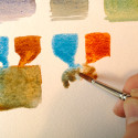
Step One: make a puddle of pure color.
Notice the tail of color coming down from the puddle, we’re going to use these to mix the colors.

Step Two: make a puddle of a different color right next to the first one.
Notice how juicy the puddles of color are. We really want to set up a rich mixture by charging each of the colors with a lot of pigment. So become aware of the balance between the amount of water to the amount of pigment.

Step Three: Mix
I just take a swipe of color across the two tails and mix them together in a new third puddle of color. This has to be one of my favorite purples out there. The two cool colors of Cobalt and Permanent Rose really play well together. Not surprisingly they make a very cool purple.
Bonus Tip:
One of the tricks that I’ve picked up over the years is how to create a wash that has clean sharp edges on it’s outside and a smooth color on the inside. For a long time I tried to do long continuous washes starting at the top of a shape and then pulling the wash down; which can work if it’s small (kinda like these washes are) but becomes really difficult if the shape is complex and/or large. Somewhere along the way I read about drawing the border of the wash first then filling it in with color, and that creates a nice crisp shape with a consistent color inside it.


This mixture was between the cool green-blue of Cerulean and the warm yellow of Raw Sienna, which come together to create a neutral earthy green.

Here we go again, but this time I have no idea what’s going to happen. I originally threw the Cerulean Blue onto the pallet because its a color that I like by its self, but I didn’t have a clear sense of how it plays with the others.

It’s a match up between the cool green-blue and the warm earthy red of Burnt Sienna. Oh god… what’s going to happen?!

Blammo!… it’s a muddy, messy, grayish, color…(yea?)… and where on earth would you ever find that color? Trees, rocks, dirt.. who paints that stuff anyway?

Conclusion:
There you have it, with a simple set of steps repeated over and over again, you can achieve a myriad of different outcomes. I hope that you will challenge yourself by doing this, and as you go along see if you can start to guess what the mixtures are going to do and how they’ll be. I certainly was surprised more than once. One last tip that I’ll leave you with (and I may live to regret this,) is that I do talk to myself out loud when I am doing these exercises. The verbalization helps to emphasis the experience for me.
As ever, thank you for reading. I respond well to enthusiasm, so feel free to leave a comment here, drop me a line, or follow me on the Insta-tweet-a-books.
Instagram • Facebook • Twitter
If you enjoyed this post, please consider supporting my work by making a small monthly donation to my Patreon Page.


Thank you, Brian. I am just starting to explore watercolor and I’m looking forward to trying this exercise out.
Howdy Samantha,
Yes! Please try it out, it’s a pretty nice way to wade into the watercolor world. I hope that you get a lot out of it.
Please keep us posted as to your results too.
Cheers,
Hi Brian!
Love this exercise! I often just have a little experiment with colors when I have some spare time, but this is definitely a more consistent way of understanding colors, so will be trying this out!
Ever since I started cleaning my palette after each painting session (so daily haha) and having 2 or more jars of water on my desk…my colors are much more clear and true to the actual color I mix up.
Thanks so much for sharing this!
Ciao Ciao,
TJ
Howdy TJ,
I’m glad you liked this exercise, it really is just aimed at getting to know your colors and how they play with the other kids on the pallet. It can also be a stepping stone to looking at others’ watercolors, and starting to guess what their pallet may have been too.
Glad to hear that you’re experiencing the positive effects of having a clean water handy. I always felt like that was a good move.
Remember to share your results, it’ll be fun to see what other’s come up with.
Cheers,
Brian, like the article. I haven’t used watercolors in years and it would be nice to experiment with it again. Watercolor painting is very challenging and always enjoy what you have achieved.
Hey Paul,
Glad you liked the article. I think that with the clean line work that you do, watercolor would be another nice addition to your illustrations. Certainly that method of using line and watercolor in illustration has worked for folks from Arthur Rackham and Edmund Dulac, all the way through to modern day illustrators like Jack Unruh, Joe Ciardiello, John Cuneo, and many many more!
Thank you for the comments!
hi, i’m preparing a class on color mixing and this is great! i too like ‘everything you need to know” but i find the chickens a bit daunting for some. I like you very clear instruction!
Howdy Katie,
Glad you like the explanations. Keep you’re eyes peeled for a new posts coming up, there is more on color coming soon! But in the mean time, perhaps this post might be interesting to you too: Begin Using Color Choices To Strengthen Your Paintings
hey Brian, i really like the colors, are really strong and vivid but i’m worried about the grays, are they supposed to look so dirty?
i’m looking forward to do the exercise thank you very much for the advice
Hey Mauricio!
Yup, those grays really end up helping to build value and can be modulated from warm to cool. That being said, I don’t really use all of them, recently I’ve finally found a combo that I think will work well for a watercolorists “Painter’s Gray”.
Wonderful post..thank you so much for sharing!!
Hi Shirley, I hope that you found it useful. I am trying to start a watercolor class here in San Francisco, and these exercises are right at the top of the list of things to do.