
I’m continually humbled by how much I don’t know. Every once and again I get to where I start thinking that I’ve really got a handle on this “illustration-thing” and sure enough, out of left field will come some great bit of information and I find myself scratching my head thinking, “Why didn’t I know this before!” That’s the way it is with Local Values.
Summary: What are Local Values? What is a Value Pattern? How can these help me to create stronger Illustrations? Enjoy this step by step process and find the answers to these questions.
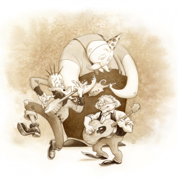
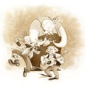
A quick note to the reader; This image was developed for a presentation that I was asked to give to an illustration class. I wanted to show examples of the value of a local value study, so I worked up this fun monochromatic piece.
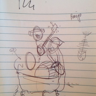
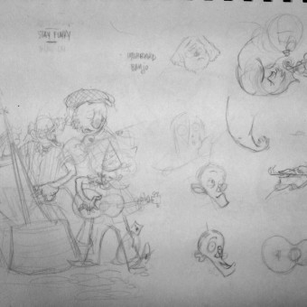
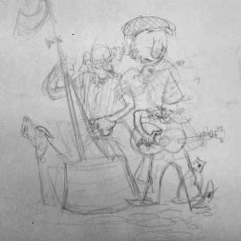
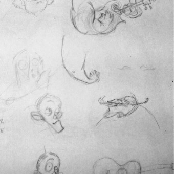
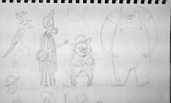
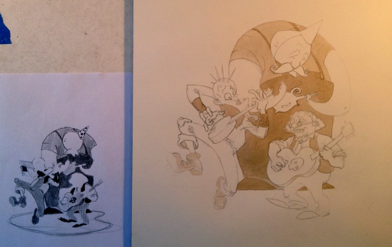
Beginning with exploratory sketches
Learning What I Didn’t Know
If you hang around an illustration critique for about 5 minutes, someone is bound to bring up “values,” and for good reason. Values are possibly one of the most important tools that an illustrator can use to communicate with.
Let’s start with my basic misunderstanding about Value Studies. I had always thought of a Value Study as describing how the light wraps around the forms in an illustration. Which it is. Imagine my surprise when I read that there isn’t just one type of value study, but two!
“We’re with the band.”
Light and Shade are obviously important to information to have before you move into making a illustration, but equally important is a Local Value study. I’d even go so far as to say that the Local Value study should be done before attempting the Light and Shade value study.
What are Local Values?
The local value is the overall value of a subject regardless of the effects of light.
For example, as I type this I am wearing a black sweater, and blue jeans; my sweater is a darker value than the jeans. It won’t matter if I am standing in a spotlight, or hidden away in a shadow, those basic value relationships will remain the same; dark top, lighter pants.
Try It: Take a moment right now to try a little experiment. Find a single object that is nearby, and squint at it. As you do so, start by making a simple observations about the local value of the object; is it darker or lighter than the object or space that is around it. Go ahead give it a shot, remember to stay basic, simple, general.
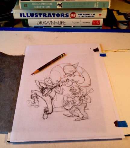
Transferring the sketch onto watercolor paper.
We Join Our Process Already In Progress
A brief statement of my sketch process up to this point: Thumb > Rough > Character Studies > Rough Final Drawing > 2 Xerox Copies of the Rough Final Drawing (one at scale to transfer onto the watercolor paper, and one approx 3 x 3″ for the Local Value Study)
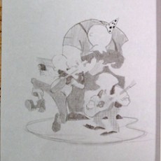
(Editor’s note: The original value study couldn’t be found, so this image is taken from a photograph. My apologies for the low quality of the image.)
What I discovered and began to understand, is this idea of “value pattern.” I’ve heard the term before but for the first time it became apparent that the way these flattened shapes fit together is in fact the value pattern. Light Bulb Moment!
Making the values work in an image becomes a little bit easier by using the local values first. As many people have said;
To create a focal point in your illustration, place your lightest light next to your darkest dark.
By using local values, you can arrange your value shapes together to create a clear focal point.
Painting Local Values
I started with my Local Value study handy for constant reference. The painting began with basic flat washes. These are simple statements of value, “this is darker than that, that is lighter than that, etc.”
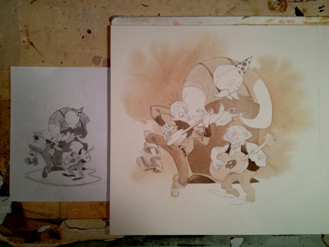
Still referring to the Local Value Study, I lay in the next round of washes.
The beginning values on the final painting are lighter than the study because they will become deeper during the painting progresses. It is their overall relationship to one another that is critical throughout the painting.
With some more time and energy, I brought this image up to a finished state. Details, details, details.
Conclusion:
So, there you have it, by creating and using a Local Value Study as a guide you can establish a stronger value pattern which will help you to clarify the focal point of your illustrations.
Thank you for visiting!
As ever, I respond well to enthusiasm. Feel free to leave a comment, share with friends, and connect via the Insta-tweet-a-books.
Instagram • Facebook • Twitter
If you enjoyed this post, please consider supporting my work with a monthly donation to my Patreon Page.


What a great process post. Thanks for writing it.
I do a similar thing (after I was taught) by printing my line drawing composition onto tracing paper (make sure to tape tracing paper to regular paper before sending it through, trust me). I use gray scale markers (about 4 values) on the back side, turn it over and use black & white prismacolor pencils for lightest/darkest values and details. The markers make it really fast so you can do a few in no time. Especially if you want to change the light source.
This turned out AWESOME, by the way!
What a good idea… I hadn’t thought about using markers to do this. I may have to give that a shot, thanks for the tip!
I’ve been wanting to read this for a while and am glad I did. You’ve articulated this method in a way that not only demonstrates the care you have for your work/craft, but really brings to light an important step in the illustration process that, for me, has often been driven more by instinct than planning. Plus, those Sepia tones are just fantastic.
Donna, what you’re describing sounds brilliant. I’ve been playing with Grayscale markers (COPICS in particular) lately but using the front and back of tracing paper is something I will have to try.
Brian,
It’s difficult enough to create a drawing with all the elements
in a synchronized composition. If the final is in color a value study is necessary and makes your color comp that much easier. Like a conductor orchestrating the the final elements with precision until hopefully your masterpiece is finished. A lot of hard work.
Enjoyed your article,
Paul
Howdy Paul,
Thank you for the kind words. Yes, there are so many details to consider when making a piece, but as illustrators, I think part of our job is to communicate as clearly as possible the heart of the image. Definitely hard work!
Cheers
Howdy Patrick,
Thanks for taking note of the level of care that I endeavor to imbue into my work. In the end, I believe that’s what resonates with the audience.
I hope that you’ll give the local value method a shot. Like I mentioned above, these can be small but their value as a road map while creating a painting (especially in watercolor) is indispensable.
FYI, the sepia tone = Van Dyke Brown and Ivory Black.
Thanks,
Hi Brian,
Thanks for the tips. I did have a lot of ideas on how I can make my illustrations look more alive and natural..
Howdy Gizelle,
Thanks for taking the time to read the post, and I’m happy to hear that helps with creating illustrations that are more alive and natural, that’s great!