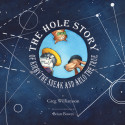
Summary: This blog post covers a book project that I worked on from the end of 2014 to the beginning of 2015. I was hired to create a cover illustration and a number of black and white interior illustrations for the book The Hole Story of Kirby the Sneak and Arlo the True. (buy yours at: Waywiser Press )
Greetings Internet-friend!
Since this is a rather long blog, you can skip ahead to:
As ever, I respond well to enthusiasm. You can leave a question or comment below, and share this with any friends who might also enjoy it.
Initiating the project
I was first approached by Greg Williamson in September of 2014 when he contacted me through my website. I was intrigued by his email for a couple of reasons. It was clear from his initial email that he had done his homework and was familiar with my work. He said that he found me through the Hire an Illustrator website and that he liked the Ichabod Crane illustrations. He provided the publisher’s website, WaywiserPress.com. He also had fair budget in mind. (By the way, if you’re interested in learning more about the process of hiring an illustrator, here is a fantastic place to start your research: Hiring A Childrens Book Illustrator!)
This was his story pitch to me:
My book is called The Hole Story of Kirby the Sneak and Arlo the True, and it is going to be published early next spring by Waywiser Press (a UK pub). It is approximately 1200 lines, or about 60 pages. Ideally, 20 drawings would be nice, but fewer than that might work as well. A combination of full page and smaller inserts is an option too.Of the two main characters in the story, Arlo is a redbone coonhound and the self-appointed watchdog of the Burbles’s backyard. Kirby is a border collie who counts cards, studies genealogy, knows trigonometry and particle physics, and is regularly trying to play pranks on Arlo.
…As for what I’m hoping to find, generally, I want playful and sophisticated, clever & funny, but not too cartoonish–the book has a childlike feel, but the language and references are adult, so I wouldn’t say it’s necessarily a children’s book.
Ok… I’ll just say it, he had me at “a dog who knows trig and particle physics!” Now that is compelling idea!
We are off to a great start
Now the real work began. Greg mailed over a manuscript which I read thoroughly many times. Let me just say, the level of difficulty of writing a 60 page poem in rhyming couplets and NOT making Seuss-ized words to make the rhymes work is off the charts! But, Greg pulls it off and the story just flows beautifully.
Drawing from the wonderful material in the story, I quickly set about finding some key moments that I’d like to illustrate, and doing many… many… many thumbnail drawings!
Greg and I shared some great conversations via email and over the phone. I truly enjoyed our conversations as they were far reaching and idea rich. It was as if Greg and I were friends that just hadn’t met yet. We talked about theories of the universe, the history of measured time, and music. It was really fun!
Final Illustrations
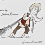
One of the ideas that occurred to me was that at about the mid-point of the story, Kirby’s head gets whacked, but good! It is at this point in the story that his perception starts to shift. My thought was that this moment was something like a Satori, or instantaneous enlightenment of sorts. I wanted the illustrations to reflect this, so in the beginning of the book they are pretty “normal” and by the end there’s a new and different perspective. The final illustration shows Kirby as a semi-omniscient figure overlooking his little piece of the celestial sphere.
At some point I decided that I enjoy the word “spangled.” If you look closely at the illustrations you will find that there are dandelion puff-balls spangled across the images.
Spangling serves two practical purposes:
As a repeated design element it helps to tie the book together, and
Humoring the artist! (One can never underestimate the power of humoring an artist!)
The Cover
The final piece that needed to be created was the cover illustration. Initially I had a very complex image thumbnailed out, but after thinking about it, I wanted to go with something that was more graphic and striking. I had been looking at a lot of “mathy” art online and have since become quit smitten with it. I knew that I wanted to incorporate some pseudo-math into the image, not because I liked it (which I do) but rather because the main character Kirby has this sort of outlook where he’s able to leap any conceptual gap in a single bound. Let’s call it quantum pole-vaulting.
The first image was the color comp that I sent to Greg and the publisher. The second image is the final background image. I may do another blog post just on the process of creating this image because it was so unique. This is about as close to abstract art as I’ve gotten thus far in my life… and I’m not to shy to say that I like it!
The final book is published by Waywiser press in the spring of 2015, and can be purchased through their website.
And now… a New Pen and Ink Process Video!
Just for fun, I decided to record the process of inking one of the illustrations. This has been edited down to a brief 3 minutes… but just know that the inking process took a little longer than that! In fact, just for fun take a look at my wrist watch as the video goes on. Round and round she goes!
As ever, thank you for reading. I respond well to enthusiasm, so feel free to leave a comment here, drop me a line, or follow me on the Insta-tweet-a-books.
Instagram • Facebook • Twitter
If you enjoyed this post, please consider supporting my work by making a small monthly donation to my Patreon Page.


Wow!! This is wonderful, Brian!! I especially love how the cover turned out… very cool!!
Thanks Leah!
The cover was really a stretch for me!