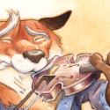
A Study in Paisley; watercolor illustration process.

A Study in Paisley; watercolor illustration process.

Summary: Detailed process of watercolor techniques, inking, and colored pencils for an children’s book illustration.

Happy New Year!

A few of you may have seen via my Instagram feed that I was developing a character study for my Sherlock Holmes character. For those who were paying particular attention, you would have noticed that I did it twice!

The reason for the do-over was that I’d used some less-than-quality watercolor paper. While that type of paper is good for a few washes, however after about two layers the colors start to lift off the page. I think that this is due to the sizing in the paper. Anyway, I redid the sketch, redid the painting, and videoed it as well!

It’s a little longer video than normal due to the fact that I’ve included some sections of real-time painting. Enjoy!

(Note: for some reason the video pop-ups are working for mobile devices, click here to go directly to Youtube.)

Video Transcript:

Hey everybody, it’s Brian with BrianBowesIllustration.com. Today, there’s a character study to share, created for a Sherlock Holmes project. This video is a bit longer than usual, with some real-time painting included. While it would be nice to paint as quickly as the sped-up videos suggest, it takes more time.

A background wash of yellow ochre sets the tone. A wet-into-wet approach is used, applying color on pre-wet paper to keep the edges soft. A one-inch squirrel brush helps blend edges smoothly. A warmer wash of raw sienna is added to the main figure for contrast, making it pop forward.

In the video, an extra set of brushes in the left hand is used to soften one edge of the wash, keeping one brush loaded with color and another slightly damp for blending.

Initial washes begin each section, including the purple mixture of the smoking jacket. This section shows real-time detailing, slowly drawing with the brush to create subtle features, like a boat used for trains and a violin.

Details on the quilted collar and cuffs of the smoking jacket add texture. Ultramarine helps achieve a puffy, quilted look.

There’s a moment where inking around the edge leads to a slight misstep, creating an edge that felt too sharp. Colored pencils were planned for softer contours, but blending the two methods worked out in the end. Sometimes continuing with ink helped it seem intentional, blending with darker pencils afterward.

Colored pencils, a newer addition, allow for gradients and extra detail, enriching the final piece. A spontaneous decision to add paisley to the smoking jacket brought an unexpected touch, which was foreshadowed in sketchbook notes.

Nearing the end of the project, reflections highlight learning through practice. The final piece, with more detail, can be viewed on the website. Thanks for watching!

As ever, thank you for reading! I respond well to enthusiasm, feel free to leave a comment, and follow me on Youtube

Sorry, comments are closed for this post.

Bo Diddley UnMasked!